
Lodybo
Implementing Font Awesome into a Remix project
- Filed under:
- Remix
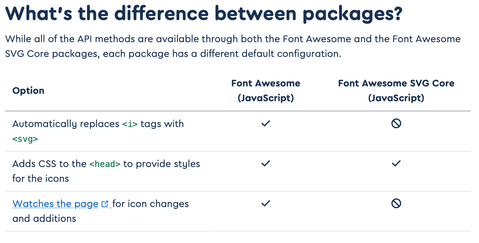
I've built a couple of projects with Remix and up until now I needed to integrate Font Awesome into all of them. There are a couple of ways that you could do this, from something as simple as using one of their kits to something as advanced as using their JavaScript API. I opted for the latter, as it brings a few important benefits for applications if you ask me (like watching the page for icon additions).
So, how do we implement this?
Installing Font Awesome
Before we move on, it might be good to know that I'm using the free version of Font Awesome. If you use the Pro version, the install steps are a little bit different.
We;ll start by installing both the SVG core and the solid icons library.
npm install @fortawesome/fontawesome-svg-core
npm install @fortawesome/free-solid-svg-icons
The @fortawesome/fontawesome-svg-core package contains a lot of the API code in order to use Font Awesome in your project. The @fortawesome/free-solid-svg-icons package contains all the free solid icons.
Creating an <Icon/> component
When everything is installed, we can start to build our own <Icon/> component. This component will receive an icon name as prop and render the SVG icon through Font Awesome's icon method.
Let's start with creating the component. I tend to create all the components in an app/components folder in order to separate them from the routes.
import type { IconName } fom '@fortawesome/fontawesome-svg-core';
import { icon } from '@fortawesome/fontawesome-svg-core';


type Props = {
	name: IconName,
};

const Icon = ({ name }: Props) => {
	const iconHTML = icon({ iconName: name }).html;

    return (
    	<span dangerouslySetInnerHTML={{ __html: iconHTML[0] }} />
    );
};

export default Icon;
Wait, what?
A lot of things are happening at the same time here, so let's go through the lines one by one. We start at the top by import'ing the IconName type and the icon method. We move downwards to Props which declares which props our component accepts.
type Props = {
name: IconName,
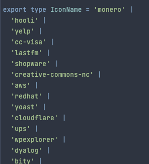
};The IconName type is what FontAwesome describes as the actual names of the icons (shocking, right?). It's actually a very big string union of all the icon names that are in Font Awesome:
So, why map name to IconName instead of just string? The main benefit is that we can make use of TypeScript's type checker and the autocompleting behaviour of our IDE and provide exactly the correct name!
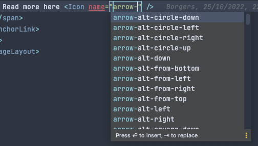
This way we can only reference icons that are actually part of the current library version we're using.
const iconHTML = icon({ iconName: name }).html;Inside our component we try to find the correct icon definition belonging to that particular name. Font Awesome supplies a function that helps us retrieving the SVG code: icon(). We supply it with the name of the icon and receive an icon definition.
The definition has a couple of properties, but we're only interested in one: .html. This returns an array of SVG codes for the icon, which is usually just one.
return (
	<span dangerouslySetInnerHTML={{ __html: iconHTML[0] }} />
);
Our component renders a simple <span/> tag (because I found that to be semantically correct), and we use React's dangerouslySetInnerHtml to embed the SVG directly inside the <span/> tag. As mentioned above, the .html property returns an array of icon definitions, but we embed a string in dangerouslySetInnerHtml, so we simply grab the first entry in the array.
Importing the icons
Keen observers have found that I left out an important part here: Font Awesome exports a library that we need to use. There are two reasons why:
icon()can only find icons that are added to thelibrary.- Font Awesome has thousands of icons available for our use, but adding all of them would massively increase page size. The
libraryallows us to subset the icon catalog and make sure only the icons we need are loaded.
So we start by importing the library and an icon before we define our props and component. It doesn't necessarily need to be defined before our props definition but it does need to be referenced before we define our component.
import type { IconName } fom '@fortawesome/fontawesome-svg-core';
import { icon, library } from '@fortawesome/fontawesome-svg-core';
import { faArrowRight } from '@fortawesome/fontawesome-solid-svg-icons';

library.add(
	faArrowRight,
);

type Props = {
	name: IconName,
};

// ...
Important to note: whenever you want to use a new icon from the Font Awesome catalog, you need to add it to the library before you can use it in your code.Now we have a very simple <Icon/> component that accepts an icon name and renders it on the screen. But what if we want an icon from a different style, or make it spin?
Supporting other styles
Until now, we've relied on the fact that Font Awesome assumes you're using the solid icon styles by default. That's why we could simply supply the name of the icon and omit the name of the style that the icon is part of. But what if you want to use both solid and regular style icons?
Let's start with adding a prefix to our Props declaration:
import type { IconName, IconPrefix } from '@fortawesome/fontawesome-svg-core';

type Props = {
	name: IconName,
    prefix?: IconPrefix,
};
Tip: theIconPrefixtype from FontAwesome contains both Free and Pro styles. I usually only need the free styles, so I extract them from theIconPrefixtype:prefix?: Extract<IconPrefix, 'fas' | 'fab' | 'far'>;
Next, we're going to add the prefix to the prop destructure of the component.
import type { IconName, IconPrefix } from '@fortawesome/fontawesome-svg-core';
import { icon } from '@fortawesome/fontawesome-svg-core';

type Props = {
	name: IconName,
    prefix?: IconPrefix,
};

const Icon = ({ name, prefix = 'fas' }: Props) => {
	const iconHTML = icon({ prefix, iconName: name }).html;

    return (
    	<span dangerouslySetInnerHTML={{ __html: iconHTML[0] }} />
    );
};

export default Icon;
You can see that I defined prefix = 'fas' in the component's prop destructure. This means that if I omit the prefix prop in my component somewhere in my code, the value of prefix will be automatically set to fas and then passed along to the library method.
Make it spin!
Okay, let's say that you want a spinning icon in your application. Font Awesome has a set of classes that we can use to animate their icons. But if we use the icon() function to retrieve an icon definition, how can we add classes like fa-spin?
The answer lies within that icon() method, it accepts a parameter object with additional options. Let's use that to our advantage and add fa-spin if we want the icon to spin:
import type { IconName, IconPrefix } from '@fortawesome/fontawesome-svg-core';
import { icon } from '@fortawesome/fontawesome-svg-core';

type Props = {
	name: IconName,
    prefix?: IconPrefix,
    spin?: boolean,
};

const Icon = ({ name, prefix = 'fas', spin = false }: Props) => {
	const classes = [];

    if (spin) {
    	classes.push('fa-spin');
    }

	const iconHTML = icon({
    	prefix,
        iconName: name
    }, {
    	classes,
    }).html;

    return (
    	<span dangerouslySetInnerHTML={{ __html: iconHTML[0] }} />
    );
};

export default Icon;
I've reformatted the icon() function to make it more readable, but you can see that there's a second object passed along. It's worth a read to see what parameters are allowed here, but you can think about transforming icons, masking them with other icons, or passing styles for your icons. With the last one you could for instance pass { 'background-color': 'red' } and generate all your icons with a red background color.
classes is defined as string | string[] | undefined, so we can pass an empty array and conditionally fill it with the classes we need. If you only ever need one (conditional) class, you can also simply pass it as a string.
The spin attribute is defined as an optional boolean. We'll set it to false by default, but we can always override it by setting the prop in our icon:
// A spinning arrow
<Icon name="arrow-right" spin />

// Not a spinnign arrow
<Icon name="arrow-right" />
If spin is set to true, the string 'fa-spin' will be added to the classes array which is passed to Font Awesome and voilá: we have a spinning icon. Of course you can use the other classes like fa-spin-pulse or one of the other animation classes.